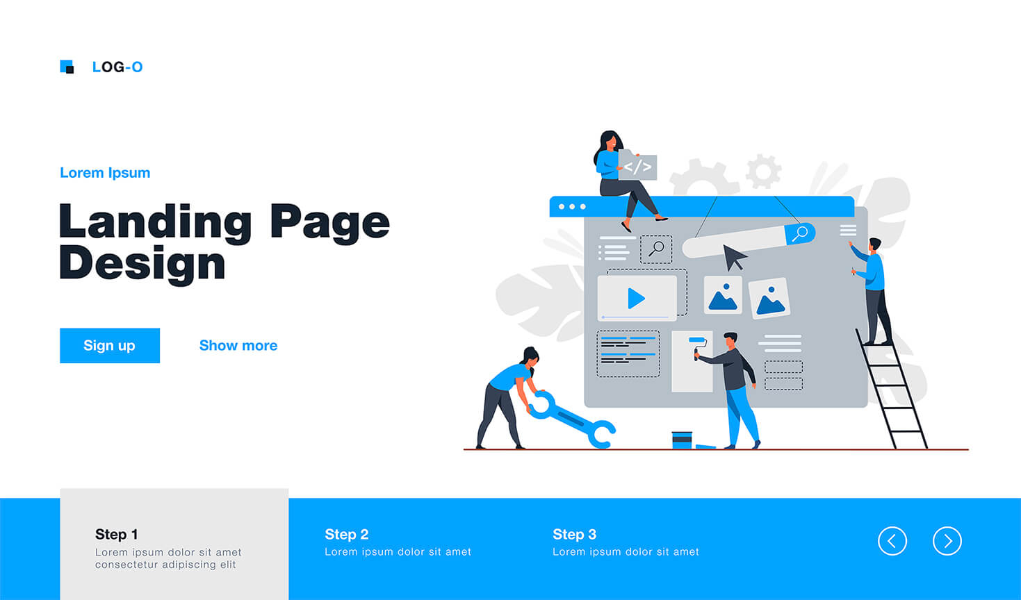
Anatomy of a Landing Page That Sells: 7 Blocks Without Which Conversion Drops in 2026
You've built a landing page, launched ads – and there are no leads, or catastrophically few. Most often, the problem isn't with the advertising or the product. Spoiler: the problem is with the page structure. There are 7 blocks without which a landing page simply doesn't convert – and most "cheap" landing pages lack half of them.
⚡ TL;DR for the Busy
- 🎯 Essence: a conversion-focused landing page is not a pretty picture, but a clear sequence of 7 blocks, each performing a specific function.
- 📈 Normal Conversion: 3–5% for cold traffic, 7–12% for warm traffic.
- ✅ Main Takeaway: if at least 3 out of 7 blocks are missing or done incorrectly – conversion drops by half.
- ⚠️ Most Common Mistake: weak hero section – visitors leave within the first 5 seconds without understanding what you offer.
- 👇 Below is a detailed breakdown of each block with examples and explanations of why it's important.
📚 Table of Contents
- 📌 Block 1 – Hero Section: The First 5 Seconds Decide Everything
- 📌 Block 2 – Social Proof: Why Clients Don't Trust You Without It
- 📌 Block 3 – Benefits: Not "We're Great," but "You'll Get"
- 📌 Block 4 – CTA: How Many Buttons and Where to Place Them
- 📌 Block 5 – FAQ: Addressing Objections Before the Client Closes the Tab
- 📌 Block 6 – Mobile Version: Where Half Your Clients Get Lost
- 📌 Block 7 – Speed and SEO: Invisible Factors That Cost Money
- ❓ Frequently Asked Questions
- ✅ Conclusions
- 🚀 Next Step
When an entrepreneur says "the landing page isn't working" – they usually mean one of two things: either the advertising budget was spent without results, or people visit the page and leave without taking action. In 80% of cases we've seen over 5 years at WebCraft, the reason is the same – incorrect structure.
This article isn't about "how to build a landing page." It's about what should be on a landing page to generate leads. We'll break down each of the 7 mandatory blocks – what it is, why it's important, and how to tell if it's done correctly.
🎯 Block 1. Hero Section: The First 5 Seconds Decide Everything
The hero section is the first screen of the landing page that a visitor sees before scrolling. It must answer three questions in 3–5 seconds: what it is, who it's for, and what to do next. If there's no answer – the person closes the tab.
According to Nielsen Norman Group research, the first 10 seconds are critical: it's at this moment that the user decides whether to stay or close the tab. If the hero section doesn't provide a clear answer "what's in it for me here" – the client is gone forever. Source: nngroup.com
The hero is not just a beautiful picture and company name. It's the first and most important selling element of the landing page. The structure of a correct hero section:
- Headline-Offer – a specific promise of a result. Not "we build websites," but "Turnkey Landing Page in 10 Days with Conversion from 5%"
- Subheadline – clarification for whom and under what conditions. "For small businesses in Ukraine. Fixed price from 7,000 UAH"
- Visual – photo of the product, result, or a person using it. NOT stock photos of people in suits shaking hands.
- Primary CTA Button – one action, specific. "Get a Quote," not "Learn More"
Most Common Mistakes in the Hero Section
In our practice, 7 out of 10 landing pages that come to us for an audit have one of these problems:
- ❌ Headline – company name instead of an offer ("Budservice Company – Your Reliable Partner")
- ❌ Vague offer without specifics ("We will help your business grow")
- ❌ Image not related to the product or service
- ❌ Button leads "down to the form," not to a specific action
- ❌ Text doesn't match the ad the user came from
Example from Our Practice
A cosmetologist from Kharkiv approached us. Her landing page headline was: "Olena Ivanova's Cosmetology Clinic – Beauty and Health for Your Skin." Conversion – 0.8%. We changed the headline to: "Appointment for Facial Cleansing in Kharkiv – Visible Results After the First Session." We didn't change anything else. Conversion increased to 3.4% in two weeks. Simply by changing the offer.
Summary: the hero section is your most important investment block. If it's weak, no one will see the rest of the landing page.
🏅 Block 2. Social Proof: Why Clients Don't Trust You Without It
Social proof is everything that shows: other people have already used your service and achieved results. Testimonials, client photos, number of projects completed, partner logos, screenshots of correspondence. Without this block, the landing page is just your words about yourself, which no one believes.
92% of consumers read reviews before making a purchase. A landing page without social proof forces the client to search for reviews on Google – and some of them don't return.
Social proof is not a single block, but a system of elements that should be distributed throughout the landing page. Here's the hierarchy by impact strength:
- 🥇 Testimonial with a photo of a real client + name + city – the strongest tool
- 🥈 "Before and After" photos – especially effective for services (cosmetology, repairs, design)
- 🥉 Result numbers – "127 clients in 3 months," "4.9 stars from 68 reviews"
- 🏅 Screenshots of correspondence or Google reviews – look authentic
- 🏅 Logos of companies worked with – good for B2B
- 📋 Certificates, awards, media mentions – enhance authority
Where to Place Social Proof
The mistake is to gather all testimonials in one block at the bottom of the page. The correct way is to distribute them across the landing page:
- ✔️ One strong client quote – immediately below the hero section
- ✔️ "Testimonials" or "Case Studies" block – after the benefits block
- ✔️ Micro-proof (stars, number of clients) – next to each CTA button
What to Do If You Don't Have Testimonials Yet
If the business is new – don't make things up. Show the process: photos of work, screenshots of correspondence with early clients, your personal guarantee. Honesty works better than an empty "testimonials" block with placeholder avatars.
Our Opinion: social proof works not just as "customer voice," but as a mechanism for reducing uncertainty. The user doesn't spend time on deep evaluation – they delegate it to others. That's why testimonials, case studies, and conversion numbers directly influence decision-making. If you remove social proof, most products appear as unsubstantiated promises.
💡 Block 3. Benefits: Not "We're Great," but "You'll Get"
The benefits block is the answer to the client's question "what will I get if I order from you?". Not "we've been on the market for 10 years" and not "individual approach" – but specific advantages in terms of results.
Most landing pages make one mistake: they write about themselves, not about the client. "We are a team of professionals," "10 years of experience," "Quality guarantee" – these are features, not benefits. The client reads this and thinks: "Okay, so what?"
The transformation rule: feature → benefit for the client.
| ❌ Bad (About Us) | ✅ Good (About the Client) |
|---|---|
| 10 years of experience | You won't waste time training a contractor – we already know common mistakes and avoid them |
| Individual approach | Your landing page won't look like hundreds of others – we develop it for your audience and niche |
| Quality guarantee | If the landing page isn't launched on time – we'll refund your money or finish it for free |
| Modern technologies | The page loads in 1–2 seconds – you won't lose clients due to a slow website |
How Many Benefits to Show
Optimally – from 4 to 6. Less than three – looks meager. More than eight – distracts attention. Each benefit is best presented in the format: icon + short title (3–5 words) + 1–2 sentences of explanation.
Summary: the benefits block is where you prove that you understand the client's needs. Talk about them, not about yourself.
🔘 Block 4. CTA: how many buttons and where to place them
CTAs (calls to action) are prompts to action: buttons, forms, links. A medium-sized landing page (1500–2500 pixels high) should have 3–4 CTAs. The first one should be in the hero section, and the last one before the footer. Each should be specific and active.
A landing page without clear CTAs is like a store without a checkout. People can browse as much as they want, but it's unclear where to go to "buy."
Effective CTA Rules
- ✔️ One action per button. "Order a landing page" - yes. "Learn more or leave a request" - no.
- ✔️ Verb at the beginning. "Get a quote," "Order a consultation," "Sign up for a demo."
- ✔️ Remove fear next to the button. "Free," "No obligation," "We'll respond within 3 hours."
- ✔️ Contrasting button color. It should stand out against the background – not blend in.
- ✔️ Contextual relevance. After the pricing block – "Get a quote." After testimonials – "Order like they did."
How Many CTAs and Where to Place Them
- 📍 CTA #1 – in the hero section (most important)
- 📍 CTA #2 – after the benefits or social proof block
- 📍 CTA #3 – after the pricing or comparison block
- 📍 CTA #4 – before the footer (final call to action)
Example from Our Practice
Client – an English language school. The landing page had one button "Contact Us" at the very end. We added three CTAs: "Sign up for a trial lesson" in the hero, "Choose a program" after the course descriptions, and "Start for free" before the form. Conversion increased from 1.2% to 4.7%.
Summary: CTAs are not just buttons. They are the architecture of decision-making. Properly placed calls to action guide the customer step by step towards action.
❓ Block 5. FAQ: addressing objections before the client closes the tab
FAQ on a landing page is not a formal "for SEO" section. It's a tool for addressing objections. Customers always have doubts: "What if it's too expensive?", "What if I don't like it?", "How long will it take?". FAQ provides answers before they close the tab and go to competitors.
The right FAQ for a landing page is not questions like "What is your company?". It's the most frequent objections and fears of your target audience, turned into questions.
How to Gather the Right Questions for FAQ
- ✔️ Ask managers: "What do clients ask most often before ordering?"
- ✔️ Look at reviews on Google and social media – they reveal real doubts.
- ✔️ Check Google Search Console: what questions do people enter before finding you?
- ✔️ Put yourself in the client's shoes: "What would stop me from ordering?"
How Many Questions and How to Format Them
5–7 questions is optimal. Fewer looks incomplete. More than 10 is overwhelming. Format: accordion (expands on click) or a list with clear question-headings. Each answer should be up to 3–4 sentences. Concise and to the point.
Bonus: SEO Effect
FAQ with real questions also helps with SEO: Google may show your questions in the "People also ask" section in search results. This is free additional traffic without any ad investment.
Summary: FAQ is a silent salesperson that answers customer objections around the clock and never takes a vacation.
📱 Block 6. Mobile version: where half of your clients get lost
By 2026, over 65% of traffic to landing pages in Ukraine will come from smartphones. If the mobile version of a landing page is displayed incorrectly, you lose more than half of potential clients. This isn't about "adaptation," but about a separate, well-thought-out version for the mobile experience.
Since 2019, Google has been using mobile-first indexing: it evaluates a site primarily based on its mobile version. If it's poor, the landing page will drop in search rankings, even if the desktop version is perfect.
What to Check in the Mobile Version of a Landing Page
- ✔️ Buttons are large and easy to tap with a finger. Minimum size – 48×48 pixels. If a button is small, the client "misses" and gets annoyed.
- ✔️ Text is readable without zooming. Minimum font size – 16px. If you need to pinch the screen, something went wrong.
- ✔️ The form fits on the screen. Input fields are not cut off, the keyboard doesn't cover the "send" button.
- ✔️ Images don't slow down loading. On mobile internet, heavy photos kill conversion.
- ✔️ Hero section is correct. The headline is not cut off, the CTA button is visible without scrolling.
- ✔️ Phone number is a link. Click – and immediately call. No manual copying.
Example from Our Practice
Client – a law firm from Kyiv. The landing page looked great on desktop. We checked the mobile version: the application form extended beyond the screen, and the "Send" button was hidden by the keyboard. Clients physically couldn't submit an application from their phones. After fixing it, the number of applications increased by 140% without changes in advertising or budget.
Summary: The mobile version is not a "bonus." It's the primary version of your landing page for most clients. Check it on a real smartphone, not just in a browser.
⚡ Block 7. Speed and SEO: invisible factors that cost money
Loading speed and basic SEO are two "invisible" factors that directly impact conversion and advertising costs. A landing page that loads in 5+ seconds loses up to 40% of visitors before they even see your offer.
Google Ads lowers the cost per click for pages with a good Quality Score. One of the components of this score is loading speed. This means a slow landing page costs more in advertising than a fast one.
Speed: What Affects It and What to Do
- ✔️ Optimized images. WebP format instead of JPEG/PNG – file size is 3–5 times smaller with the same quality.
- ✔️ Hosting near the audience. If clients are in Ukraine, the server should be in Ukraine or Europe, not the USA.
- ✔️ Minimum unnecessary scripts. Every extra plugin or pixel slows down the page.
- ✔️ Caching. Repeat visitors load the page instantly.
SEO for a Landing Page: The Minimum You Need
- ✔️ Title and description – unique, with a keyword.
- ✔️ Only one H1 and it matches the search query.
- ✔️ Alt tags for images – a short description of what's in the photo.
- ✔️ URL without Cyrillic characters and understandable: /service-kyiv, not /page-1.
- ✔️ Structured data (schema.org) – for FAQ, reviews, contacts.
How to Check Your Landing Page Now
You can check speed for free on PageSpeed Insights (pagespeed.web.dev). A score above 80 is a good result. Below 50 – there are serious problems that need fixing. Details here.
Summary: Speed and SEO are not technical quirks of developers. They are money: cheaper advertising, more organic traffic, fewer bounces. Details here.
❓ Frequently Asked Questions about Landing Pages
What conversion rate is considered normal for a landing page?
It depends on the niche and traffic source. For cold traffic from Google Ads, 2–5% is considered a good result. For warm traffic (retargeting, email marketing) — 7–12%. If you have less than 1%, it's a signal that one or more of the 7 blocks are not working.
How much does it cost to create a landing page with the correct structure?
A template landing page on a builder — from 0 to 3,000 UAH, but you are responsible for the structure and content yourself. A turnkey landing page from a freelancer — 5,000–15,000 UAH. A landing page from an agency with an audit and strategy — from 10,000 UAH. A detailed comparison is in our article "How much does a landing page cost in 2026".
Can I create a landing page myself on Tilda or Wix?
Yes, and for testing a niche or an MVP, it's a reasonable decision. However, builders limit speed, SEO settings, and design uniqueness. If a landing page is your main sales channel and you invest in advertising from 5,000 UAH per month, it's worth ordering custom development.
How long does it take to develop a landing page?
At WebsCraft, it takes 7–14 business days for a turnkey landing page. This includes: niche analysis, structure, design, layout, basic SEO, and form integration. The timelines depend on the number of revisions and the speed of material provision from the client.
What CTA button should I use — "Order" or "Learn More"?
"Order" converts better for a warm audience. "Get a consultation" or "Calculate cost" — for a cold audience, where the client is not yet ready to buy. Avoid "Learn More" — it's the least specific call to action and yields the worst results.
Do I need a landing page if I already have an Instagram page?
Instagram and a landing page serve different purposes. Instagram is for warming up and communication. A landing page is for conversion: one offer, one action, without distractions from other accounts and ads. More details — in the article "Instagram vs Own Landing Page".
Is it possible to measure which of the 7 blocks is "breaking" the conversion?
Yes. For this, you can connect Hotjar or Microsoft Clarity — free heatmap services. They show where people stop, where they stop scrolling, and what they click on. Within 1–2 weeks, it becomes clear which block is "failing". Details here.
✅ Conclusions
- 🎯 7 blocks is the minimum: hero with an offer, social proof, benefits in the client's language, correct CTAs, FAQ addressing objections, mobile version, speed, and SEO
- 📈 3–5% conversion is a realistic goal for a new landing page with cold traffic and the right structure
- ⚠️ The most expensive mistake is investing budget in advertising before the landing page has undergone a basic structure audit
- 📱 Check the mobile version on a real smartphone — not in a desktop browser
- 🔍 Measure: without analytics (Google Analytics + heatmaps), it's impossible to understand what exactly isn't working
The main idea: a conversion-focused landing page is not about beautiful design. It's about the correct sequence of blocks, each performing a specific job: attracting attention, building trust, addressing objections, and prompting action.
🚀 Want a landing page with a conversion rate of 5% or more?
At WebsCraft, we build landing pages using this structure — with offer audit, correct CTAs, and a mobile version that actually works. The cost starts from 7,000 UAH, and the timeline is 7–14 business days. The first consultation is free.
Order a landing page → WebCraft
Or write to Telegram, or WhatsApp — we will respond within 3 hours.